

Jason Hu
Jason graduated from Macquarie University with a Bachelor’s degree in Accounting, after that he worked as a bookkeeper in a smash repair for almost ten years. While learning Python and Tableau after working hour, he found he interested in data visualisation, therefore, he decided to join the Data School to gain related experience. Outside of work, He is passionate about running.

Tableau Sheet Swapping in Two Different Ways
Sheet swapping allows the users to swap the different chart in the same dashboard; for the purpose of this article, we create two charts in two separate sheets, 1. The map shows Sales for each State. 2. The line chart shows monthly sales. I will introduce two...
Four Different Methods to Calculate the Percent of Total in Tableau
In the data school training session last week, I introduced how to calculate the percent of total using the FIXED level of detail expression. In this article, I summarise four different ways to achieve this. Two from table calculation, another two are from LOD. I’m...
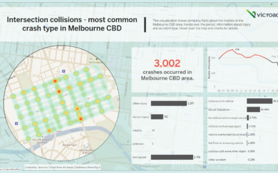
Dashboard Week | Day 4 – Collisions Analysis in Victoria
In this article, I’m writing about the 4th dashboard I build this week. The topic is the crash stats in Victoria, and I’m focusing on the collisions in the Melbourne CBD area. Introduction The dataset is from Vic Roads; it contains all accident details from 2006 to...
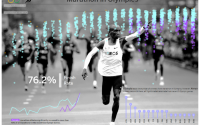
Dashboard Week | Day 2 – Marathon in Olympics
Introduction On day 2 of the dashboard week, we focused on the Olympics; this is the dataset used for the next cohort data schooler's final interview. I'm picking the marathon in the Olympics over history. The original data doesn’t include event result; therefore, to...
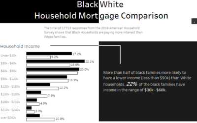
Dashboard Week | Day 1 – Black & White Household Mortgage Comparison
Introduction Finally, the dashboard week is coming; the first topic of dashboard week is about survey data from the 2019 American housing survey. I'm focusing on the household mortgage between black families and white families. Data manipulation The raw survey data is...
Tableau Desktop Certified Associate Exam: Everything You Need to Know
What is Tableau and Why should you get certified? Tableau is a trending and market-leading business intelligence tool used to visualise and analyse your data in an easily understandable format. It allows you to work on the live dataset and spend more time on data...

5 useful tips for Alteryx beginners
The first week at the Data School was about Alteryx, Alteryx is a powerful software used for data cleansing, data mining, ETL, spatial analysis, machine learning, and other BI-related activities. Its usage can range from relatively basic activities like joining...