

Seema Keswani
Seema has done Master’s in Economics and Bachelors in Education from India. She has 8 years of experience working in various domains including teaching, insurance and admin. She has always been a reporting and data visualization enthusiast, be it generating classroom metrics or providing analytics on insurance claim data. She was on a career break when her passion for stats and data brought her to Tableau. And through Tableau she got to know about The Data School.
She has recently moved to Sydney from the US and decided to develop her career as a Data analyst and her interests in numbers using Tableau and Alteryx as her tools of choice. In her free time, she loves to do portrait photography and most of the time her models are her daughters.

Power of Custom Functions in Data Transformation
Ever found yourself wrestling with data and wishing for a magic wand to simplify things? Well, my recent dive into Power Query's Custom Functions felt just like that. Today, we're diving into the world of custom functions, where you can take your data transformations...
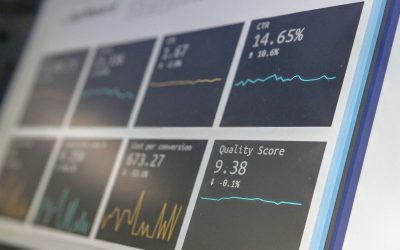
Elevating Line Charts to Interactive KPIs in Power BI
I had a bit of a challenge when I needed to create a special Key Performance Indicator (KPI) for my project. It turned out that this KPI required a bit more than just looking at revenue trends on a typical line chart. So, I decided to do a bit of research and stumbled...

Best Practices of Data Cleaning
As a Data Analyst trainee at the Data School, I've quickly learned that one of the most crucial steps in any data analysis project is data cleaning. It may not be the most glamorous task, but it's certainly a necessary one if you want to extract meaningful insights...

Get creative with Mockaroo
As a data school trainee, we are constantly exposed to new tools and techniques that can help us to develop our skills in data analytics. One such tool that we recently explored was Mockaroo. For those who are unfamiliar, Mockaroo is a platform that allows users to...

Dashboard Week – Day 3
Introduction Today was Dashboard Week Day 3. We were given a task to scrape any data from https://gs.statcounter.com/, complement it with other data sources and build an interactive dashboard using Tableau. I decided to scrape data for Mobile Trends in India. I also...

Finally- Dashboard Week – Day 5
Introduction Welcome to my blog where I'm going to take you on a journey through my experience on the 5th and the last day of dashboard week. So, the challenge for the day was to work on the data of shark attacks for past two centuries. I was under the assumption that...

Dashboard Week – Day 4 – Power Plants
Introduction Electricity is an essential aspect of our daily lives, and power plants play a crucial role in providing energy to homes and industries. On the fourth day of dashboard week we were given the challenge to work with the Global Power Plant data. Data...

Dashboard Week – Day 2
Introduction As a Data School trainee on the second day of Dashboard Week, I was thrilled to work with a new dataset on flight departures from the US to foreign countries. After exploring the dataset, I decided to create a story around flight efficiency and...

Dashboard Week – Day 1 – APIs
Introduction As the first day of Dashboard Week kicked off, we were tasked with using the Ticketmaster API in Alteryx to retrieve all upcoming events as per our preferences. This involved utilizing pagination to ensure that we captured all events, as the API only...

Upgrade Your Analytics with Tableau 2022: Replace Data Sources on a Worksheet Level
Have you ever found yourself in a situation where you needed to change the data source for a specific worksheet in your Tableau workbook but didn't want to affect the rest of your analysis? If so, you'll be happy to know that Tableau 2022 has just introduced a...