

Yashada Kulkarni
Yashada has a background in ecology and biodiversity. For her PhD, she studied pheromones in butterflies. When she wasn’t chasing butterflies in the field she was analyzing data in the lab.
Apart from being a researcher, she has worked as a biodiversity and sustainability professional with corporates. Having worked extensively with data in her previous roles, pivoting to data analytics was an obvious choice for her.
In her free time, she likes to go bird watching and reading latest advancements in Nature Tech.



Mum joins Data School
You can’t find your keys, you can’t find the time to find your keys. You can’t do Tableau, you can’t be a data analyst, you can’t be a good mom, you can’t >copy paste whatever you want here< You hear the announcement. It’s your stop. You get off the train and...

What the Data School taught me
When I stepped out of college more than a decade ago, with a Masters degree in hand, I thought I owned the world. Then I did my first gig as a field biologist and faced nature for the first time. My experiments never went as planned as I faced everything from...
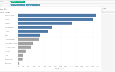
Sets with Parameters in Tableau
This is part 2 of a 2-part series. For part 1, click here. In Part 1, we learnt how to create Sets and use the Sets view to change members in the Set. In this tutorial, let us learn how to get Top/Bottom members in a Set and how to make this value dynamic. Just as the...
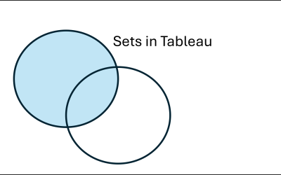
How to effectively use Sets in a Tableau visual
Sets are a powerful feature of Tableau. In this series of blog posts, I will go through some of the aspects of Sets, starting from the basics and ending with the combined sets functionality. First off, what are Sets? They are dynamic groups made of Dimensions. For...
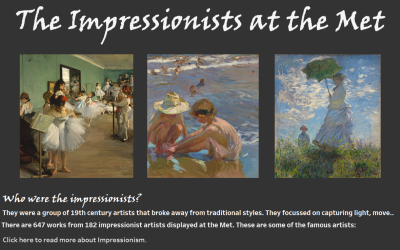
The Impressionists at the Met
Imagine my absolute delight when we were told our day #3 for dashboard week would entail fetching data from the Metropolitan Museum of Art's API. I enjoy the visual arts and going to the Met someday is one of my dreams. So for this particular dashboard, I did not take...
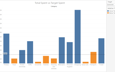
Change colours in a Tableau chart from user input
Creating bar charts in Tableau is simple. You can drag and drop relevant fields in the Columns and Rows shelves. But what if you want to add some interactivity to your bar charts? In this post, I explain how the colours of a bar chart can change based on user-defined...
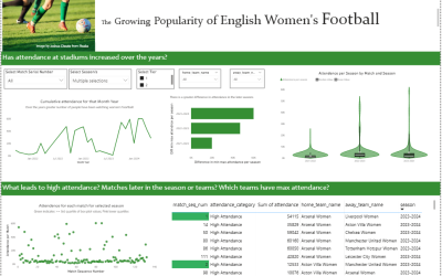
Dashboard Week Visual #2: The Growing Popularity of English Women’s Football
Background For Day #2 of the Dashboard week challenge, we were presented with a dataset about English Women's Football. The Ask - find insights from the data that are not mere overviews. Bascially, we had to dig for a story, not a dashboard with info like how many...
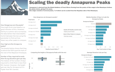
Dashboard Week Visual #1: Scaling the Annapurna Mountain Ranges
Background When I started out, it took me at least two weeks to get a good, share-worthy dashboard ready. At one point in our training at the Data School, you are supposed to churn out one dashboard a day. Yes, that's right. Essentially, you are given a data set at...
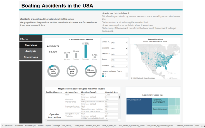
A few Tableau dashboard design tricks I learnt the hard way
When I first started out with Tableau, I just dragged things onto the dashboard because it's the most intuitive thing to do or perhaps it's a result of having worked for years in a Microsoft environment. You expect a Tableau...
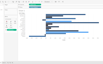
How to create a custom color palette in Tableau
Custom color palettes in Tableau are fast and easy to set up. It is one the many features of Tableau that makes it fun to use as you can play around with a lot of color options once you have custom color palettes set up. Did you know you can create a custom color...