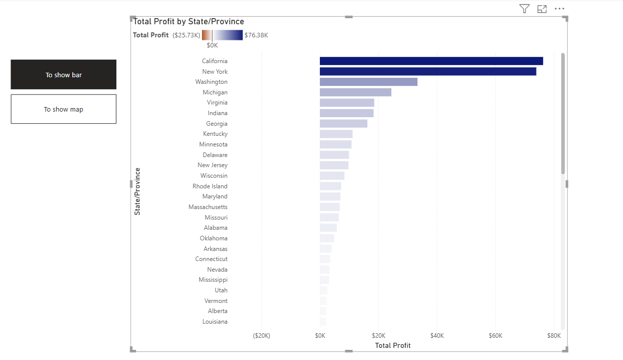
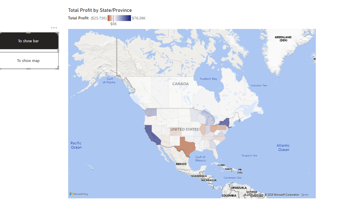
Welcome to Creating a Map with a Colour Legend in Power BI-Part 2 of the blog. Let us continue creating the colour legend.
Step 1:
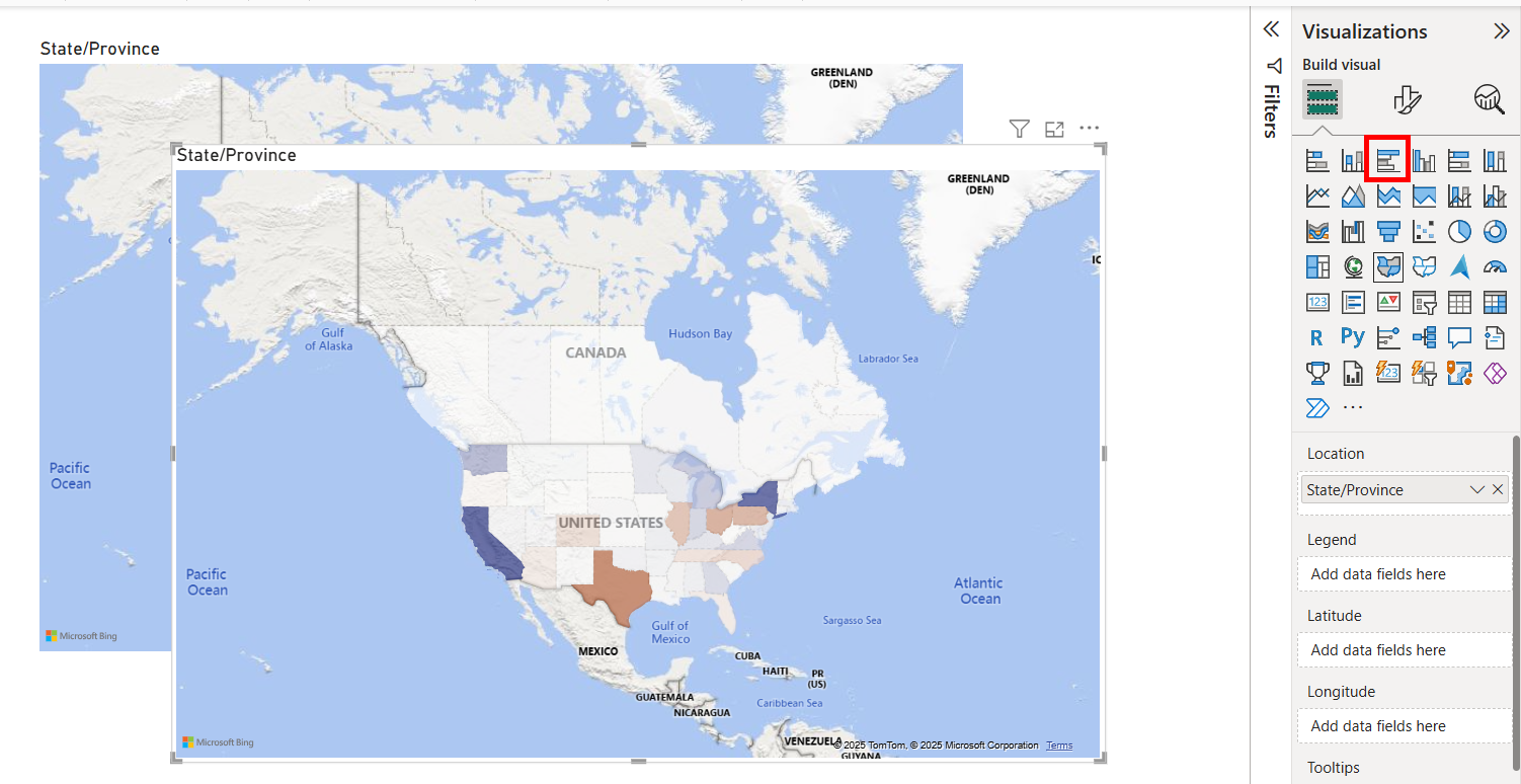
Create a new copy of the map and turn that into a Clustered Bar Chart with ‘Total Profit’ in the X-Axis.

Step 2:
Align in the way that the map stays in the front, and the bar chart with colour legends stays at the back.

 Step 3:
Now we are creating two buttons( Map & Bar) to toggle between the two visuals.
Go to View and click Bookmark and Selection.

Step 4:
To show the map with the colour legend from the bar chart, Under the ‘Selection’ tab, Choose both the visual and click ‘Add’ in the ‘Bookmark’ tab and mention a name to the bookmark. Click on the option and choose ‘Selected Visuals’.

Step 5:
To show the bar with the colour legend from the bar chart, Under the ‘Selection’ tab, Choose both the visual and click ‘Add’ in the ‘Bookmark’ tab and mention a name to the bookmark. Click on the option and choose ‘Selected Visuals’.

Step 6:
Now insert a button-> Navigator-> Bookmark Navigator.

Now Ctrl+Click the bookmark button to toggle between two visuals.