

Jack Woodward
Jack holds a bachelor’s degree in information technology from Griffith University and has work experience in IT Support and retail. Throughout his studies he discovered a passion for data and presenting it in a visually appealing format. This passion led to Jack applying for The Data School to begin his career in data analytics.
In his spare time, he enjoys reading, live music and watching sport.


A Guide to Date Functions in Tableau
In this post, we'll be exploring date functions in Tableau. We'll start off with a cheat sheet, showcasing the more commonly used date functions with examples and outputs. And then diving into five real-world use cases, such as shipping delays, month-over-month sales...

Row-Level-Security (RLS) in Power BI
What is Row Level Security (RLS) Row level security is a feature in Power BI that allows you to restrict data access on who is viewing the report. Instead of creating multiple dashboards for separate audiences, RLS allows you to apply filter dynamically so each user...

How to Create a Donut Chart in Tableau
Donut charts are a great alternative to pie charts as they offer a cleaner visual layout, creating a useful white space in the center that can be used to display key insights, totals or additional context. Since Tableau doesn't have a built-in donut chart type, I'll...

My Four-Month Training Journey
The Early Weeks Early on in the training, we were introduced to Tableau, Power BI, Alteryx, and SQL. Most days generally start off by covering the basics, working out something like x + y, and I'd remember thinking to myself 'okay, this is easy'. But fast forward to...

Reflecting on my Interview Viz – Four Months Later
To get into the Data School, you're asked to create a Tableau visualisation using a provided dataset and present it during the interview, explaining your story and key insights that you uncovered. Now with my four months of training coming to an end, I wanted to take...
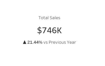
Tableau – Dynamic Year over Year KPI with Trend Arrows
In this guide, I will walk through how to create a dynamic KPI that updates based on a year parameter. It will also contain trend arrows and a percent difference to enable clear year over year analysis. Trend arrows are powerful addition to KPIs, offering instant...

Power BI: Creating Interactive Hide/Show Information Buttons
Through the use of such Power BI features as buttons, bookmarks and the selection pane, you can you create interactive reports where users view information only when needed. This makes the report easier to read and navigate, while also improving the overall user...

How to Call APIs in Alteryx
In this guide, I will walk through how to make a GET request in Alteryx using the Game of Thrones API. This is a free API that does not require authentication and has no usage limitations. Making it a perfect API for practice and learning. Step 1: Text Input Tool The...
Dashboard Week – Day 4: Crosswords
Our second Power BI task had us looking at a Crossword Dataset. The data was mostly clean, only requiring a custom key column for the capability of joining the puzzle information and answer information. I decided to focus solely on The New York Times and answers for...

Dashboard Week – Day 5: IMDB
The final task for dashboard week involved working with an IMDB dataset. We received seven excel files that covered IMDB ratings, title information, crew, episodes, year of release etc. As I've had a hunch that the Western genre has been making a comeback, I decided...