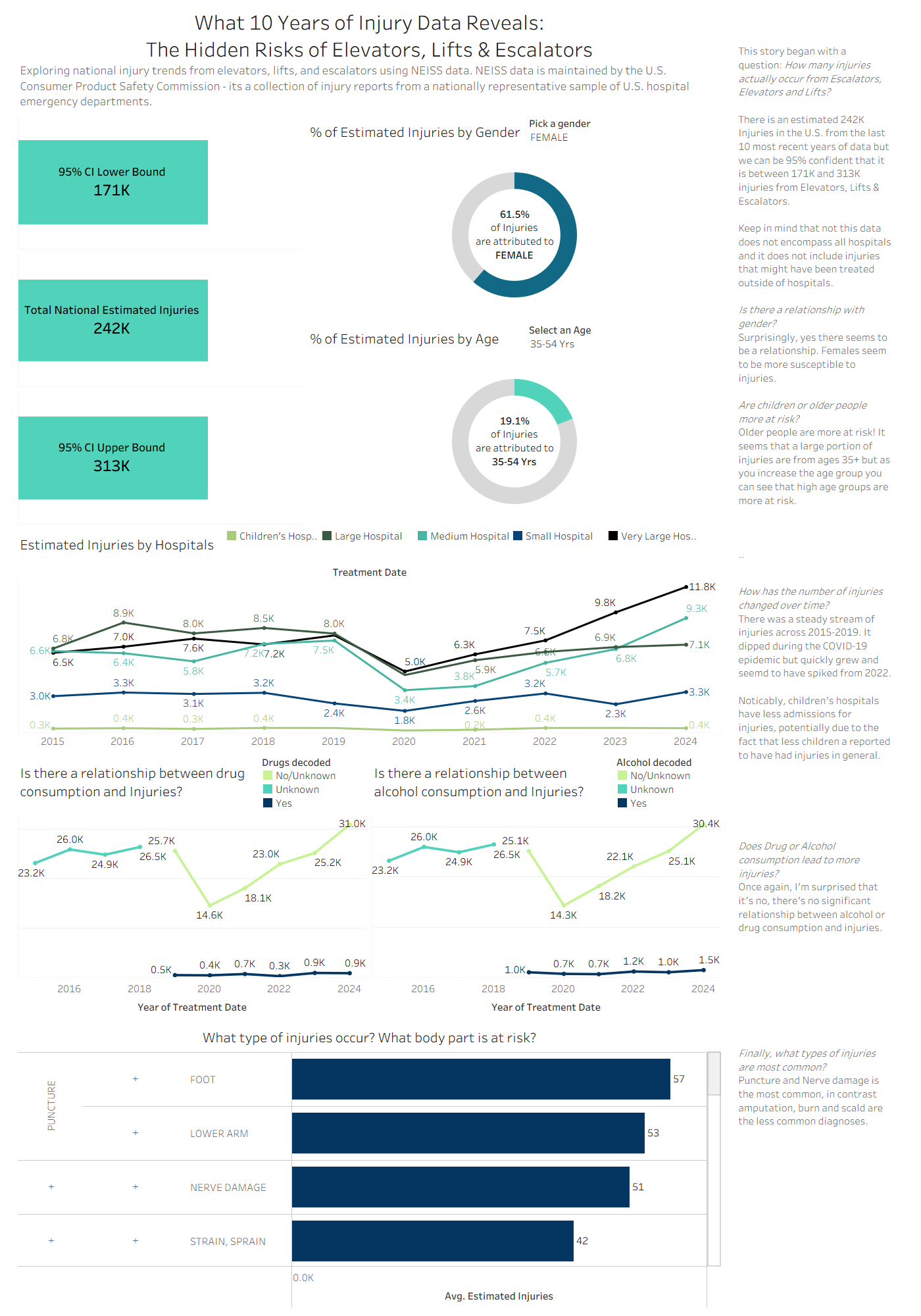
My Dashboard
It’s the 3rd day of Dashboard week! The last two dashboards were challenging and the third is no exception; this is true for both its perplexity and intrigue. We have been tasked to utilise the NEISS (Natural Electronic Injury Surveillance System) database with the tool for visualising this data being Tableau. Fairly straightforward, right?
I scrolled once.
Then I read the catch.
The data was all consumer product related injuries occurring in the USA from 2004 to… 2025. That is a lot of data to choose from… which could be a good thing. Nonetheless, this meant we had mountains of data to narrow down into a focus to construct a concise dashboard. At least we had plentiful options. With all the room this left me with, I needed to unveil the story beneath the syntax. I wanted something ubiquitous, unique but unsuspecting, so I explored the miscellaneous product side and found exactly that – elevators and escalators.
Let’s Dive in
I’ve watched many people rushing to and fro during my everyday commute to work – mother’s and father’s and children and businessmen and businesswoman all rushing up and down escalators and lifts without a second thought.
So, is there a need for caution or can we continue as obliviously as always?
The Data
I selected the 10 most recent years of data and all age groups for my research. The data required some reading to be done before getting to work; I perused the data dictionary, as well as the CPSC website in detail to find out how the data is structured. The data is at a national level, hence, the correct way to visualise and compare was through the estimated value and the raw case value. I was interested in seeing the CV and CI values as a statistician because it helped me feel assured about the statistical significance of the data. Furthermore, there were tonnes of data so I needed to make sense of it all, and what better way than sorting the data?
Cleaning and Prep
The instructions suggested creating dim and fact tables which I began to do in tableau prep. This took some time to create keys and work out a logical way to separate out dimensions from the fact table. The data also provided a table with codes and the relevant meanings as most of the data was created in that manner; for example: ages 2-120 were actual ages but there were ages from 200+ which were actually for infants from 1 month to 24 months. As a result, to attempt to have the more comprehensible values, I opted to create a way to connect this data to the main data table. I endeavoured to accomplish this through pivots, aggregation and even a create rows.
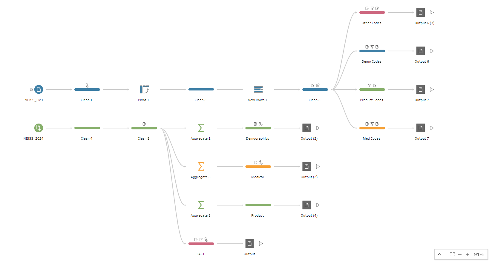
Unfortunately, this process was more time consuming than I had expected and it still did not work! Once I connected it in tableau – and because the dimensions, fact tables and time itself was not on my side– I settled with creating the fields in the main table. I achieved this via large IF statements in tableau prep, as this appeared to be my only option if I was to complete anything.
The Design
Once this was completed, I began designing my dashboard and finding useful insights. Those insights are explained in detail within my dashboard, so if you’re interested you can browse it in your own time.
In Summary
Overall, the task was interesting, and the data was a gold mine of information. There was honestly so much that could be explored, and the insights could be complemented by other data but there’s never enough time to do it all.
So, without further ado here’s my dashboard: