

Hi everyone, welcome back to my blog. Today we had an extensive training session on Level of Detail Calculations (LOD). We are shown the difference between FIXED, INCLUDE, AND EXCLUDE and when to use them. I was not quite comfortable with LOD and avoided them before. However, I am more comfortable with LODs after today’s session. I developed a good relationship with LOD and started to favor them over table calculation. The reason is that I have more control over LOD compared to the counterpart when it comes to filtering. Let me show you the cool things that I’ve learned today by building a chart that uses nested LODs showing the min and max values for sales over the entire monthly sales. Less talk and start building our chart now.
1. Computing a Monthly Sales Chart that highlights the selected region
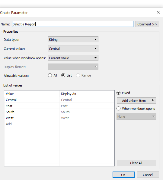
Create Region parameter
Drag [ Order Date ] to Columns, Left-Click, then choose continuous Month
Drag [ Sales ] into Rows and [ Regions ] into Detail.

Create a calculated field in order to highlight our selected Region
Selected Region vs. others
IF [Region] = [Select a Region] Then [Region] else ‘Others’ END
Drag the newly calculated field into Colour

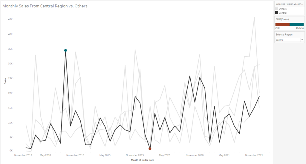
At this stage, we have a chart that highlights our selected Region. Next, we need to create Max and Min Sales Value that are presented by dots with contrasting colours.
2. Creating Circles that represent Max and Min Sales Value
For this step, we need to create our nested LOD calculations as below
Monthly Sales by Region
{FIXED [ Region ], DATETRUNC( ‘month’, [ Order Date ]): SUM( [ Sales ] )}
// Sales by Region and Month
MIN Regional Sales
{EXCLUDE DATETRUNC( ‘month’, [ Order Date ]) : MIN([ Monthly Sales by Region ])}
// looking at the Regional Monthly Sales and return the minimum sales value
MAX Regional Sales
{EXCLUDE DATETRUNC( ‘month’, [ Order Date ]) : MAX([ Monthly Sales by Region ])}
// looking at the Regional Monthly Sales and return the maximum sales value
[MIN/MAX Regional Sales]
IF SUM ( IF [ Region ] = [ Select a Region ] THEN [ Sales ] END ) = ATTR ( [ MIN Regional Sales ] ) OR SUM ( IF [ Region ] = [ Select a Region ] THEN [ Sales ] END ) = ATTR ( [ MAX Regional Sales ] THEN SUM ( [ Sales ] ) END
// For every selected region only, returning the maximum and minimum values
// This calculation will just return the maximum and minimum values only in order to compute the two dots.
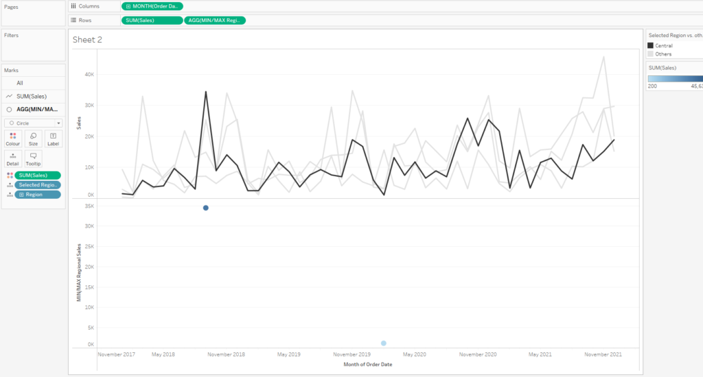
Drag the [ MIN/MAX Regional Sales ] into Rows
Click on [ Selected Region ] then changes to Detail and drag [ Sales ] into Colour.
3. Edit colour and Formatting
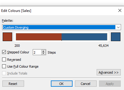
Click on Colour Legend -> Edit Colours -> Custom Diverging under the Palette dropdown.
Finally, make a Dual Axis then Synchronise them all together.
I hope you enjoy my tutorial and find it useful. Thank you for following along.
