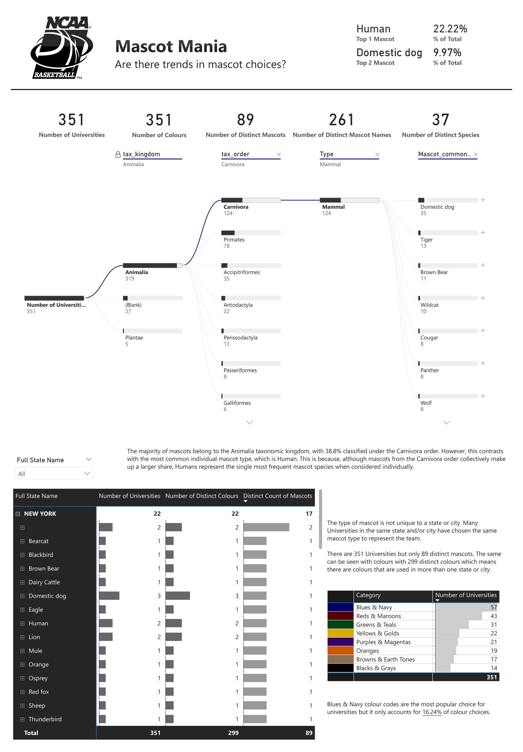
Today – the second day of dashboard week – we have been tasked to create a Power BI report. The visualisation should be based on the NCAA basketball database that’s from Google Big Query. This time I felt inclined to go on a journey – one which would lead us to discover the trends of Mascots and the choices in their design.
Connecting to the data
Google Big Query was simple enough to connect to, but this could be due to my prior experience with Google Cloud – back when I tried to connect to the Google Books API for a different dashboard challenge. Therefore, for myself, I simply needed to log into my Google Account when prompted by Power BI and select the relevant tables for my analysis.
The Data
I loaded in the “mascots” table, “team colours” table and “teams” table. The mascots table being my primary focus and the others were supportive. By the end, I had joined a few new tables from data I found elsewhere, such as a table with data on states so I would get the full name of a state and not just the abbreviation. I also generated a colour category table using ChatGPT – I wish I had the time to connect to an interesting API that I found but that was not going to be possible. The other table that I connected to was another table generated but by Claude – to get more descriptive information on the taxonomic order data as some of the names where confusing and this allowed me to ameliorate my understanding of the categories.
Reporting
The rest of the time, my focus was on uncovering the best way to find and display insights, while discovering interesting patterns or trends. This was more difficult than expected due to the limitations of the data chosen but I made do. I found that, surprisingly, the same mascot species could be used by multiple universities in the same state. I would have assumed that more variation would be expected to ensure distinctness between teams. I was also surprised that “human” was a popular mascot species considering there are so many interesting variations that are available and wouldn’t it be more exciting? Well, I’m no expert in this field — to each their own, I guess.
Styling
I chose a very minimalistic black and white styling which was quickly reinforced by the logo I found of the NCAA Basketball that was in black and seemed to just fit perfectly with my vision. I felt this stark contrast suited the university logos as well and so I went with this format.
In conclusion
Overall, I am satisfied with the result. With consideration to the data itself and the tables I chose, there were limitations to what I could visualise. It’s an improvement in more ways than one – my timeboxing was more efficient and the results were a step above, as far as I can tell.