


-
The Data School
Posts

Fake Data Challenge
Welcome back to my blog, I know this is very late, but I am going to talk about my experience completing the final challenge at...

Dynamic Titles (Chart and Axis)
Welcome back to my blog. Today I will be showing you how to make dynamic axis and chart titles. The first step is to create...

Declutter Your Dashboard!
Dynamically show and hide visuals in Tableau and Power BI How many times have you been put off by the appearance of a noisy graph,...

Dynamic Reference Line
Welcome back to my blog. Today I will be showing you how to make a dynamic reference line in Tableau. In the realm of Tableau,...

Percent Change at the Granular level
Open Tableau with superstore data. Drag order date as a continuous month on the columns shelf and category on the rows. Just to have an...

First Week in The Data School Down Under
I came across Tableau very first time while attending information session about The Data School Down Under. As a student of Data Science, I was...
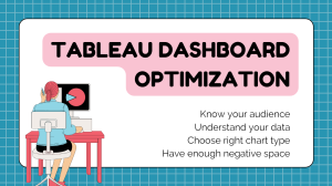
Tableau dashboard : Optimize visualization
Have you ever wondered if your tableau dashboard has too much information? Like me, you probably didn’t think either. As analysts, most of the time...

I wish I knew Alteryx earlier when I was learning data analysis
The data analysis technology is swiftly improving, the ability to efficiently clean and prepare data is paramount. Data preparation is a crucial step in the...
Blue vs Green, The Most Common Tableau Challenge.
I’m excited to share a snapshot of my first week at DAS2023 Brisbane, where I joined six talented individuals chosen from 138 applicants. Our first...

How to make bar in bar charts (Stacked Bars)
Bar in bar chart or bullet charts, allow you to compare two measure against each other, for example, comparing last year profits with this year’s...