


-
The Data School
Posts
Create a Likert Scale Chart in 5 Minutes
A quick and easy tutorial on how to build a Likert Scale Chart - a great way to visualise survey data.

My First Client Project Experience
After 4 weeks of intensive training in Tableau and Alteryx, we started our first client project on the 6th July. So far we learnt the...
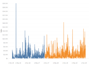
Creating Adjustable Reference line and changing chart colour using parameter
Last week we learnt creating adjustable reference lines and changing chart color based on reference line using parameters in Tableau. Parameters allow you to give...

The Complete Guide to Alteryx Analytics for Beginners: P2
Context This blog covers the Feature Engineering of the model building process. If you want more context on how to explore the data and the...
How to create Pareto Chart in Tableau
Pareto Principle ( also known as 80% of the effects come from 20% of the causes). To test whether superstore sales follow Pareto’s law we...

How to create a density (heat) map – Alteryx vs Tableau
Difficulty Level: Beginner (Alteryx/Tableau) In this week at the Data School’s training program, we learned spatial analysis and how to obtain data via API &...
The Complete Guide to Alteryx Analytics for Beginners: P1
Getting Started This will be a step by step guide for doing predictive analytics in Alteryx, using the example of the Titanic dataset. It will...

How to Create and Use Parameter?
Parameters: Parameters are dynamic values that can replace constant values in calculations, filters, and reference lines. There are four steps to creating and using a...

The Seven Deadly Sins of Tableau Visualisation
Explore and understand some of the quick tips for visualisations in a fun and interesting manner

6 Simple Ways to Enhance your Tableau Map
Difficulty Level: Upper Beginner – Intermediate One of the problems I encountered when I first learned Tableau was that map took up a lot of...