


-
The Data School
Posts
Dashboard Week Day 2: Power BI Day
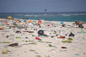
On Day 2 of dashboard week, our resident Power BI expert Madeli set us a challenge of using Power BI to visualise global plastic production...

Dashboard Week – Day 2 – Mission Power BI
In Day 2 of Dashboard Week, we were given the challenge to Design some powerful and convincing dashboards illustrating the impact of plastic on our...

Dashboard Week: Day 1 – Using Domain’s API to Explore Sydney House Prices
It’s day one of Dashboard week for DSDU3, and our opening challenge is to use the Domain API to download Australian housing market data and...

Dashboard Week – Day 1 (Domain.com API)
During Day 1 of Dashboard Week, we were given the task to make the call to Domain.com through an API key and then clean the...
Creating Sankey Chart in Tableau!
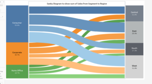
Sankey Diagram shows the flow in the relationship between two different elements. I made Sankey Diagram in Tableau using Sample Superstore Dataset to show the...
Show survey data in a trendy way!
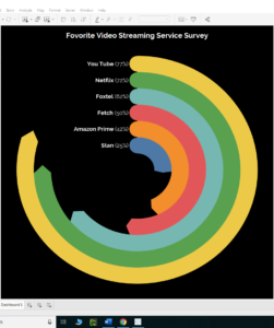
I am using Radial Pie Gauge Chart to show dummy data for Video Streaming Services people use. 1. The dummy survey data was recorded in...
Project Management Tips for Data School Client Projects
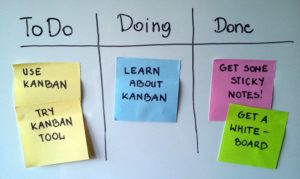
Project Management Tips for Data School Client Projects

How to create a Radial Bar Chart in tableau?
I am using Superstore subset data for creating a radial bar chart in tableau to show sales by product category for each year. 1. First,...
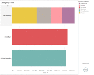
Parameter Actions to drill down
This blog is a demonstration to use latest parameter actions feature of Tableau 2019.2. It helps to drill down in the selected category of a...

Alteryx Designer Core Certification Exam Made Easy
Are you planning to give Alteryx Designer Core Certification Exam? This blog is right for you. Here are some useful tips from my experience for...