

Christopher Ktenas
Chris graduated with a Bachelor of Commerce, majoring in Finance and Marketing, and decided to pursue his passion for analytics after discovering the amazing potential of Tableau in his Marketing Metrics unit. The Data School specifically drew his attention due to the comradery and learning opportunities. In his spare time, Chris primarily enjoys engaging in sports; particularly rugby league and basketball; but is also fond of technology and music.

How to Design Dashboards for Mobile and Tablet Using Tableau
Mobile phones and tablets are becoming increasingly important for dashboard design, fulfilling the purpose of conveniently accessing information while traveling. In today’s blog, I use the excuse of needing to complete my Tableau Resume to revisit this topic and share...

How to Create a Radar (Spider) Chart in Tableau
In a previous blog, I suggested three charts to analyze a conjoint analysis, with my last suggestion being a radar chart. Knowing that it was a simple chart to build in excel, I thought it must not be very difficult in Tableau. Unsurprisingly, there is content out...

My Project Lead Experience, and Focusing on Presentation Skills
Week 15 of the Data School had Ivy and I share the project-lead status. For today’s blog, I wanted to share my experiences with what I learned being project lead and about my presentation skills focus throughout the week. My Project Lead Experience: Being the...

DSAU5 Dashboard Week Day 2: ARRRRR Pirates
Dashboard day two brought back DSAU5’s pirate juices by analyzing Piracy data from the National Geospatial-Intelligence Agency. Specifically, our task was examining spatial analytics, while bringing in some supplementary data. This morning I started differently to the...
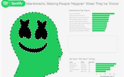
DSAU5 Dashboard Week Day 1: Marshmello and Spotify
The First Day of Dashboard Week for DSAU5 had Jonathon (JC) from DSAU1 task us with connecting to the Spotify API and visualizing the data. We could either download our personal Spotify data or use the public data available. At first, I thought it would be interesting...
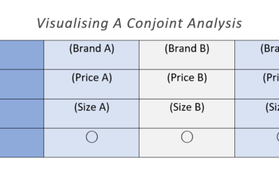
How to Visualize a Conjoint Analysis in Tableau
Week 6 of The Data School Down Under introduced DSAU5 to survey data. With excellent guidance from Tram Trinh and some supporting resources (e.g. Data Revelations Blog), we learned how to prepare and visualize single response, multiple response and Likert survey...
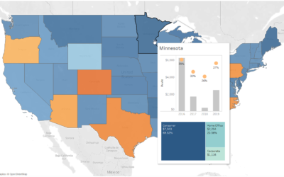
How to Insert Sheets into a Tableau Tooltip
One of the major challenges with dashboard design is presenting all the information required in a compact form, allowing for easy understanding within a glance. Tableau provides several options to aid this compact understanding, including buttons, hidden containers,...

Top 7 Reasons to Begin a Career in Data Analytics
You have stumbled across the Data School Down Under, and one of your very first questions may be why should I train for 4 months, with 24 months of placements? For me, the answer was simple to pour my heart into the unconventional application process when I thought...