

Jeff Hwapyeong Kim
Before joining the Data School, Jeff completed his bachelor’s degree in Christian Theology and Chaplaincy. This degree gave him many valuable skills such as the ability to collaborate with others, team management, and presentation.
However, after the degree, Jeff spent a lot of time at home because of the Covid lockdowns. During this time, Jeff explored different skills he could learn at home and discovered the field of Data Analytics. He was instantly drawn to Data Analytics because of its relevance in people’s lives and what data analysts can achieve with complex datasets.

My First Experience as a Project Lead – Challenges and Tips
Context: Client Project at The Data School The client project is a part of the Data School's four-month training. During the training period, every data schooler gets to be a project manager, solving real-world problems and delivering solutions to clients. There are...

How to Change the Colour of Bars Based on Average Values Tableau
Context As you can see from the screenshot above, the bar chart has a lot of categories but it has no colour difference. You can still see which category comes below or above average, it is still hard to pinpoint. Tableau can improve this view using a simple...

How to Improve Your Data Visualization / Dashboarding Skills
Lesson from Dashboard Week As mentioned in the last posts, the Data School Sydney had a dashboard week. Dashboard week is a week where we (the Data Schoolers) build a dashboard every single day. We get the dataset in the morning (not a clean dataset). And we build a...
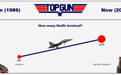
4th Day of Dashboard Week: Building a Comparison Dashboard
Dashboard Week: Day 4 As mentioned in the last posts, the Data School Sydney is having a dashboard week. Dashboard week is a week where we (the Data Schoolers) build a dashboard every single day. We get the dataset in the morning (not a clean dataset). And we build a...

How to Have Multiple Average Lines One Chart: Fixed Level of Detail Expressions
Level of Detail Expression When working with data and creating charts, there will come a time when you need to compute values on different levels. We call this "Level of Detail Expressions," and the following screenshots show what we mean by LOD Expressions. In...

Dashboard Week: Bringing Supplementary Data to Enrich Dashboards!
Dashboard Week: Day 3 As mentioned in the last posts, the Data School is in the Dashboard week. And, today's challenge was to create a dashboard using England's House price index data set. (access the data: https://data.london.gov.uk/dataset/uk-house-price-index)...

Regex, regex, regex: Essential Tool for Web Scraping – Alteryx
Dashboard week: 2nd Day In the last blog, I mentioned that DSAU14 is on the dashboard week. Today's task was to build a dashboard on UFO sightings. As much as it was challenging to engage with the topic and brainstorm ideas about what to put on the dashboard,...

Know Your Nutrition: for Keto Based Diet
Context It is a dashboard week in the Data School Sydney! This means that we, the data schoolers, are building one dashboard each day with the dataset we are given at the beginning of the day. Dataset We had the dataset from Food Standard Australia and New Zealand:...

Another Reason To Be The Next Data Schooler!
Data School is... Data School is a fascinating place that prepares you to be a successful Data Analytics Consultant. If you know a bit about Data School, you may be aware that the Data School trains Data Schoolers, for 4 months period, with market-leading Data...