

Prerana Amatya
Prerana holds a bachelor’s degree in Environmental Engineering. She began her journey into data analytics as a research assistant, dedicating two years to climate change research at an international research institute.
Seeking to broaden her horizons in business and technology, she transitioned to software development. Over two years, she honed her skills as a UX designer, specializing in crafting analytical dashboards for various clients.
With a keen eye for detail and a passion for uncovering insights, Prerana is eager to merge her analytical prowess and creativity in her new role in data analytics. She is excited to embark on this journey at The Data School, where she aims to apply her expertise to drive impactful business solutions. In her free time, Prerana enjoys cultivating plants in pots and expressing her creativity through painting.


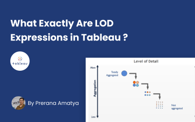
What Exactly Are LOD Expressions in Tableau ?
Understanding LOD Expressions Tableau offers a lot of features and tools to decipher the complex datasets and meet the diverse needs for data analysis. Among these, LOD expressions, or Level of Detail expressions, are a cornerstone feature in Tableau that enable users...
Extra Tools Every Data Analyst Should Consider to Enhance Efficiency
As a data analyst at the Data School Down Under, I've had the privilege of working with some of the industry's leading tools like Tableau, Alteryx, and Power BI. However, in the day-to-day grind of analysis and presentation, I've found that certain lesser-known tools...
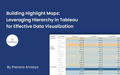
Building Highlight Maps and Leveraging Hierarchy in Tableau for Effective Data Visualization
A highlight table is a form of data visualization where values are shown in different colors. This makes it easy for people to see which numbers are bigger or smaller just by looking at the colors. As we dive into creating our first highlight map in Tableau, it's...