

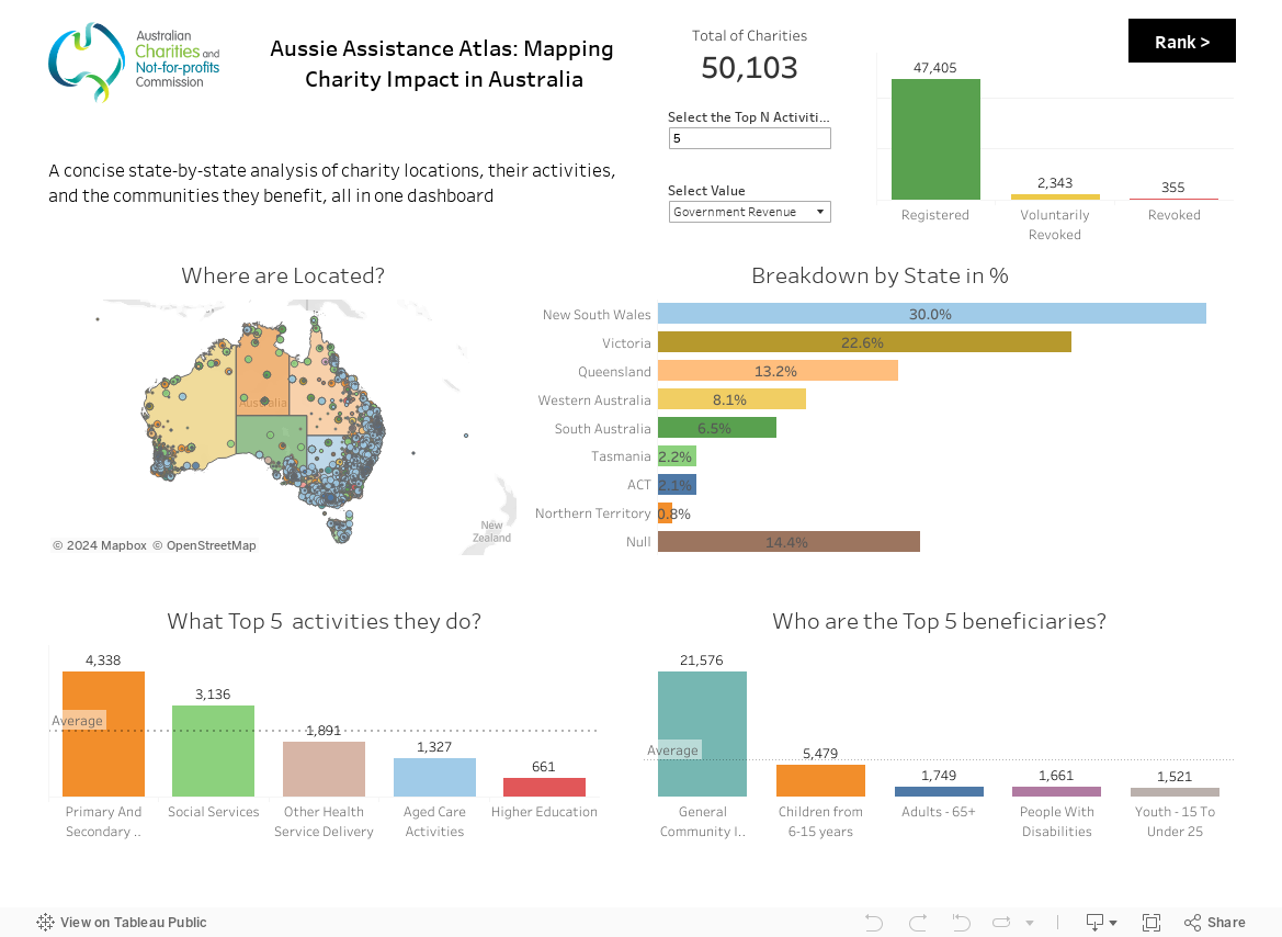
I’m excited to share my first blog in the Dashboard Week project – a comprehensive analysis of charity organizations across Australia. This analysis focuses on the financial efficiency and sustainability of these charities, offering a new perspective on their operations and impact.
In this dashboard, I utilized a comprehensive dataset from the year 2017 to 2019, encompassing various Australian charities and focusing on their activities and locations. I have applied several financial metrics for thorough analysis:
- Sustainability Ratio: Total Revenue / Total Expenses.
- Self-sufficiency Ratio: (Revenue from Goods and Services + Revenue from Investments) / Total Revenue.
- Cost Per Dollar Raised: Employee Expenses / Total Revenue.
- ROI for Employee Expenses: Net Surplus/Deficit / Employee Expenses.
- Employee Expense Ratio: Employee Expenses / Total Expenses.
Based on these metrics, each charity is assigned a score that reflects its financial health and operational efficiency.
Conclusion
This project has been a revealing journey into the financial workings of Australian charities. The scoring system offers a clear, quantifiable way to understand each charity’s effectiveness and areas for improvement.
I encourage you to explore the dashboard and see how different charities perform.
