


-
Queency Yustiawan
Posts

How to Make the Most of Dashboard Week
Dashboard Week is one of the most intense (but also incredibly rewarding!) challenges in the Data School experience. Each day, we receive a new topic...
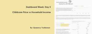
Dashboard Week: Day 5 – Childcare Price vs Household Income
Today was the final day of Dashboard Week, and I think it was the toughest one yet! With only half a day to complete our...
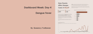
Dashboard Week: Day 4 – Dengue Fever
Today’s challenge for Dashboard Week took me into the world of dengue data, using the dataset from OpenDengue. This dataset provided a snapshot of global...
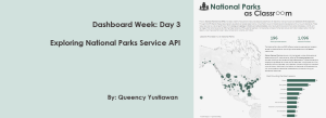
Dashboard Week: Day 3 – Exploring the National Parks with the NPS API
For Day 3 of Dashboard Week, we dove into the rich data provided by the National Park Service (NPS) API. This API is a full...
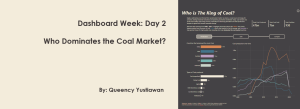
Dashboard Week: Day 2 – Who Dominates the Coal Market?
It’s Day 2 of the Dashboard Week! Today is a power BI challenge and we’re diving into an extensive mining dataset that covers global coal...
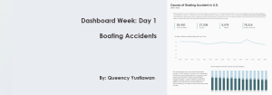
Dashboard Week: Day 1 – Boating Accidents
Today kicked off Dashboard Week, and we were handed a detailed dataset on boating accidents across U.S. coastal areas from 2009 to 2023. It covered...

Dumbbell Chart in Power BI
Dumbbell charts are a great way to visualize the differences between two data points across categories, such as gender distribution by age group. However, Power...

Dynamic Zone Visibility in Tableau
Dynamic Zone Visibility is a powerful feature in Tableau that allows users to control the visibility of various elements or zones on a dashboard based...

Exploring Data Modelling in Power BI
This week at The Data School was all about diving deep into Power BI. From foundational concepts in data modelling to creating powerful visualizations and...

Dynamic Sales Comparison Using Tableau Table Calculations
For our third week at the Data School, we learned about LOD (Level of Detail) and table calculations in Tableau. These concepts are powerful tools...