

Nikhara Inderlal
Nikhara is a passionate mathematician and statistician living in Sydney, Australia. She graduated from Macquarie University in 2022 with a Bachelor of Science Degree, Majoring in Mathematics and a Minor in Statistical Modelling.
She began sharing her interest in data and statistics while teaching at Macquarie University for 2 years, training students on using Excel for Hypothesis Testing, Data Visualisations, and Linear Regression as a teaching associate for Business Statistics students. She also worked as a Research Assistant and Lead Sessional at Macquarie University, where she worked with professors to handle student queries, content creation, delegation, and management and worked on an in-depth Literature Review for a Research Project.
Nikhara joined The Data School as a data analytics consultant to expand her technical skills and explore the exciting nature of creating stunning visualisations that provide detailed insights.
Her hobbies include baking, playing the piano, creating digital art, and designing, which allows her creative nature to shine. She also enjoys swimming, outdoor walks, and yoga.


Connecting and Visualizing API Data in Power BI
One of our Friday Challenges at the Data School was to connect to an API in Power BI and design a Power BI report using the data we extracted. We had the choice to connect to any API of our choosing with or without authorization or pagination. The API I chose to...

Thursday Dashboard Week Challenge
Introduction It’s day 4 for dashboard week. There have been many trials and tribulations to overcome. None that I may forget, yet has reforged my comprehension, enthusiasm and skill set for developing comprehensive dashboards, especially under time sensitive...

Tableau Pareto Chart: Identify Key Contributors With One Powerful Visual
Welcome to my tutorial on Pareto Charts. This tutorial will demonstrate step by step how to create a Pareto chart. As you follow along you can watch and listen to my demonstration in parts or scroll down to the bottom of the page and watch the full recording in one...
Lessons in Leadership
As the end of my training period draws closer, I want to reflect on the topic of leadership – specifically being project lead – and the challenges, the methods and the experience. I will try to provide a concise compilation of all the tips that I have gathered from my...
Wednesday Dashboard Week Challenge
My Dashboard It’s the 3rd day of Dashboard week! The last two dashboards were challenging and the third is no exception; this is true for both its perplexity and intrigue. We have been tasked to utilise the NEISS (Natural Electronic Injury Surveillance System)...
Tuesday Dashboard Week Challenge
Today – the second day of dashboard week – we have been tasked to create a Power BI report. The visualisation should be based on the NCAA basketball database that’s from Google Big Query. This time I felt inclined to go on a journey – one which would lead us to...
Monday Dashboard Week Challenge
For this dashboard week, the first challenge we received was a task to build a comprehensive dashboard which would utilise the Playbill Internet Broadway database – specifically on tableau. It was daunting at first; but - like always - when faced with a task of such a...

The Fastest 8 Weeks. The Longest 8 Weeks.
As I now reach the halfway point of my training period, I’ve decided to reflect on this voyage through Data and Analytics that I embarked on. My name is Nikhara, and I am working at The Data School as part of the 28th Cohort in Sydney. I began my journey here in 2025,...
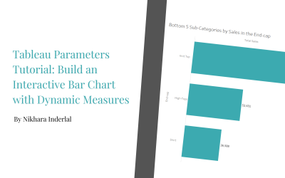
Tableau Parameters Tutorial: Build an Interactive Bar Chart with Dynamic Measures Part 2
Welcome to Part 2 of my tutorials on Tableau parameters, we will be building on our previous work from Part 1. In Part 2 we will be creating the following parameters: Parameter 3 – Dynamic Measures – ‘Select a measure’ (string parameter) Parameter 4 – Dynamic...
Tableau Parameters Tutorial: Build an Interactive Bar Chart with Dynamic Measures Part 1
Welcome to my tutorials on Tableau parameters. These tutorials will demonstrate step by step how to create 5 unique parameters to produce an interactive bar chart with dynamic measures. This type of visualisation is an exploratory style that allows users to interact...