


-
Ehsan Adl
Posts
Measures Vs. Calculated Columns In Power BI
In Power BI, understanding when to use a measure and when to create a new column can impact performance, flexibility, and how data is displayed....

How to Publish Your Power BI Dashboard into Novypro
If you want to know how to publish your Power BI dashboard into Novypro.com follow me:) 1. First, you need to Publish your report (dashboard)...
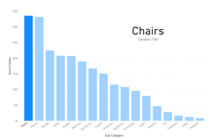
How to Create Dynamic Titles In Power BI
Hello everyone, If you want to create a dynamic title Power BI, follow these steps: Using Sample Superstore dataset, 1. Create a measure and give...

How To Create a Combined Set In Tableau
Hello everyone, For example, In Sample Superstore, If you want to show both Top and Bottom 10 Customers, you should create a combined set: 1....
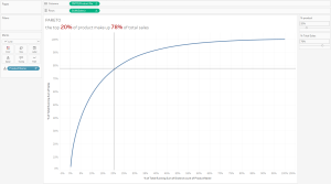
Add Dynamic Reference Lines Into Your Charts (Example: Pareto Chart)
Hello everyone, in this post I want to explain how to add dynamic reference lines into our Pareto Chart. If you want to see how...
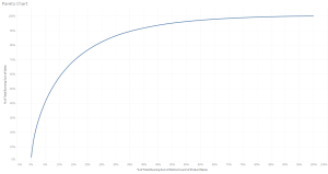
Visualizing the Pareto Principle in Tableau
In Sample Superstore: Put Sum of Sales in the Rows and Count Distinct of Product Name in the Columns. Put Product Name to Detail (in...
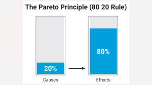
Pareto Principle (80/20 Rule) in Data Analysis
In the world of data analysis, efficiency and impact are crucial. One of the most powerful tools to achieve this is the Pareto Principle, often...
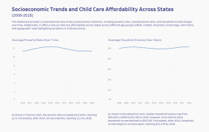
Socioeconomic Trends and Child Care Affordability
Hello everyone, The last project of Dashboard Week focused on child care in the United States from 2008 to 2018. The dataset contained over 200...
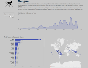
Day 4 of Dashboard Week : Dengue
Hello everyone, the 4th project for the Dashboard Week was about Dengue : Do you know what Dengue is?! Dengue is a mosquito-borne viral infection...
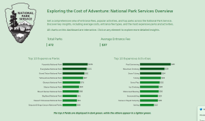
National Park Services Api
Hello everyone! Today, I want to share insights from the third day of Dashboard Week, where we focused on working with APIs. Our project centered...